|
From:TheBahamasWeekly.com Computer Korner
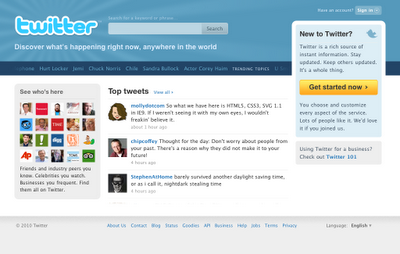
Twitter's new homepage, aside from being simply more aesthetically pleasing than the old one, does a much better job of showing new users what the service is actually about. The first thing you'll notice upon visiting the new page is that Twitter has put its most popular topics, tweets, and users front and center. Right in the middle is now a "Top Tweets" section that dynamically updates. Twitter uses a custom algorithm to decide what these are, often due to popularity or general interest. On the left is now a sampling of high-profile users, from celebrities to publications to news outlets to just normal people. Hovering over those icons gives more information about that user, including their latest tweet. Best of all, the trending topics are no longer a static clump of text, but a dynamically scrolling list. Hovering over that list will tell you exactly why Justin Bieber is popular (though only in the "number of tweets" sense, not in the more esoteric "why in God's name is Justin Bieber a trending topic?" sense). Essentially, the redesign should give prospective Twitter users a better pitch for why they should start using the network. "Look!" it says. "CNN's tweeting, and Michael Ian Black is over here being clever, and the new Big Picture column from Boston.com is, as always, amazing!" From the official Twitter blog: "All of our recent changes embrace the notion that Twitter is not just for status updates anymore. It's a network where information is exchanged and consumed at a rapid clip every second of the day. With so much being shared, we know that there's something of value for everyone. People who internalize the value of Twitter understand the power of this simple medium. But it hasn't been easy to make that value transparent or obvious for curious folks coming to Twitter for the first time."
|
